01
Speed at the till
Large tap targets, one search field for names, barcodes and PLU codes, and a total that never leaves the screen.
 Punya
Let's talk
Punya
Let's talk
Case study · Product design
A point of sale design for a supermarket, from the checkout lane to the back office, built as 32 screens on one design system.
The challenge
At the checkout lane, speed is everything: find the product, confirm the total, take payment, call the next customer. Behind the counter, the store needs a calmer view of stock, suppliers, staff, money and customers.
FreshMart POS is a design exercise in serving both with one system. The goal was a single visual language that feels fast at the till and clear in the back office, without the two halves feeling like different products.
Principles
01
Large tap targets, one search field for names, barcodes and PLU codes, and a total that never leaves the screen.
02
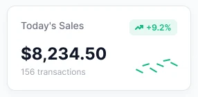
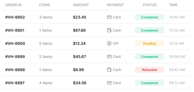
Colour is reserved for meaning: one orange for action, and green, amber and red for status, so tables and dashboards can be scanned at a glance.
03
The same shell, components and spacing run through all 32 screens, so a new module feels familiar before it is understood.
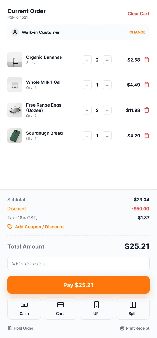
01 · Checkout
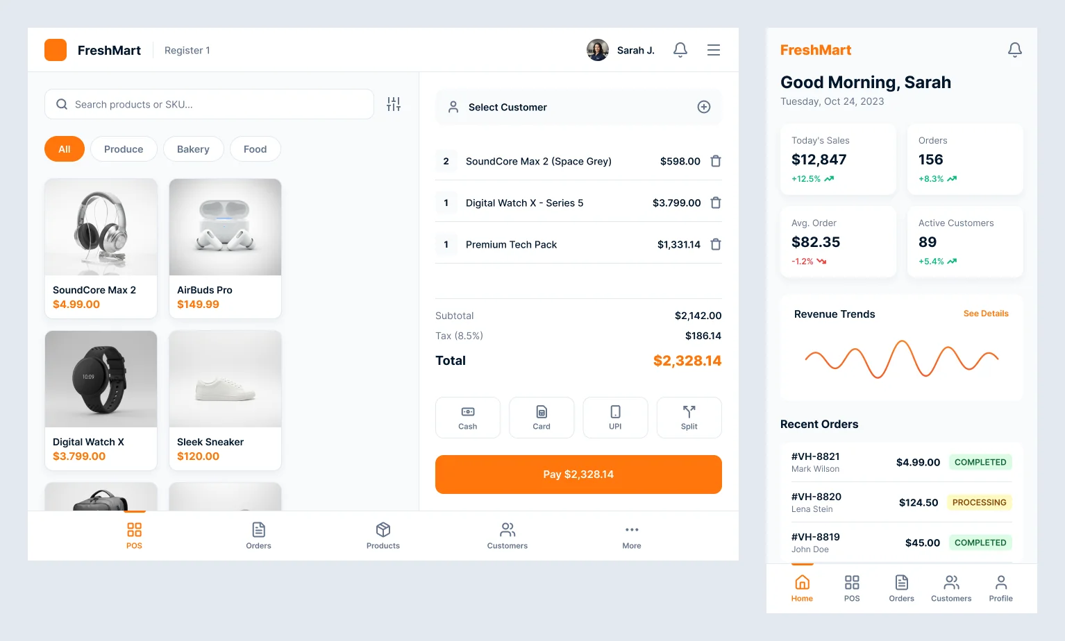
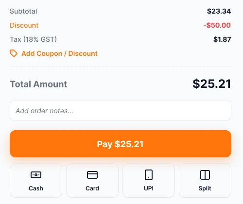
The terminal is split in two: the catalogue on the left and the live order on the right. Everything a cashier needs sits within thumb reach.
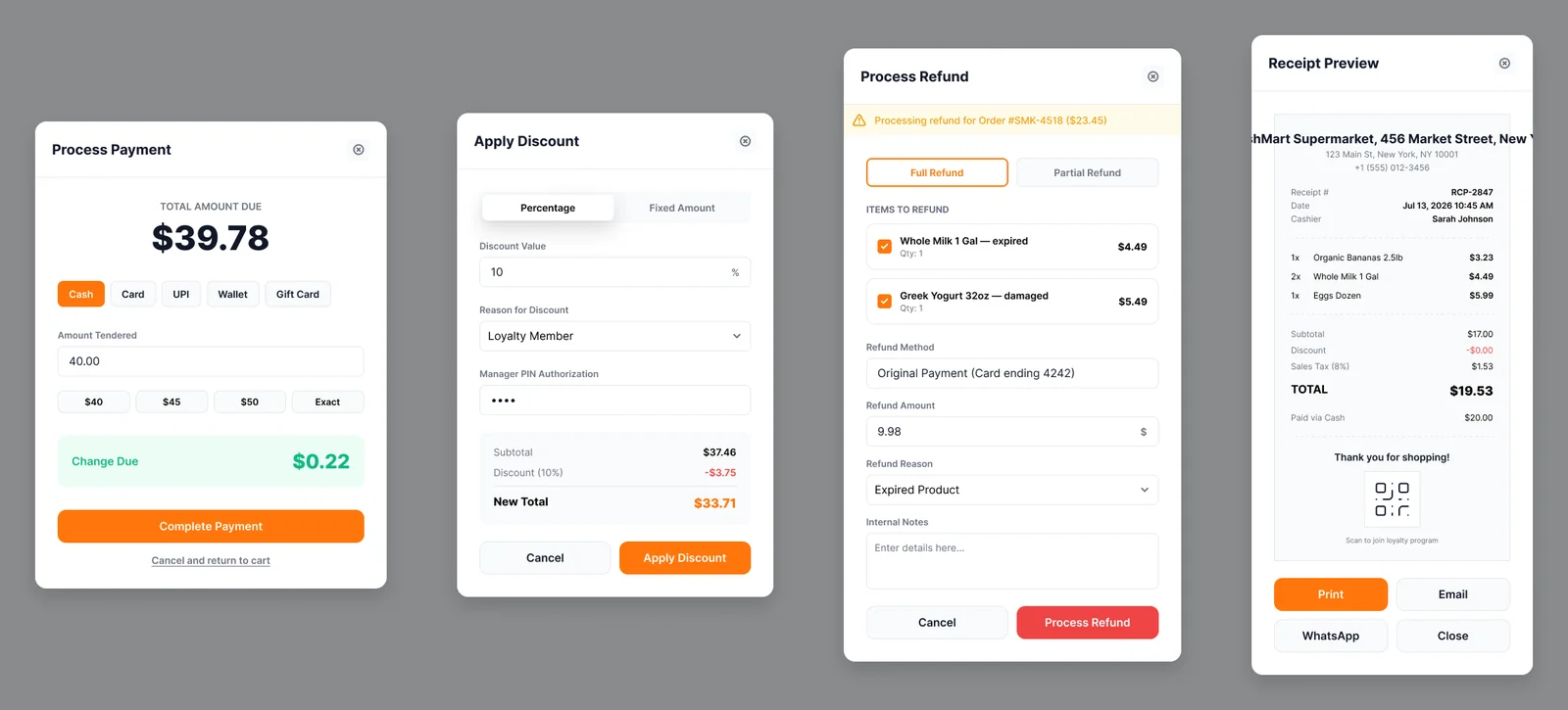
02 · Decisions
Payment, discounts and refunds happen in focused modals, so a cashier can finish one decision before returning to the sale.
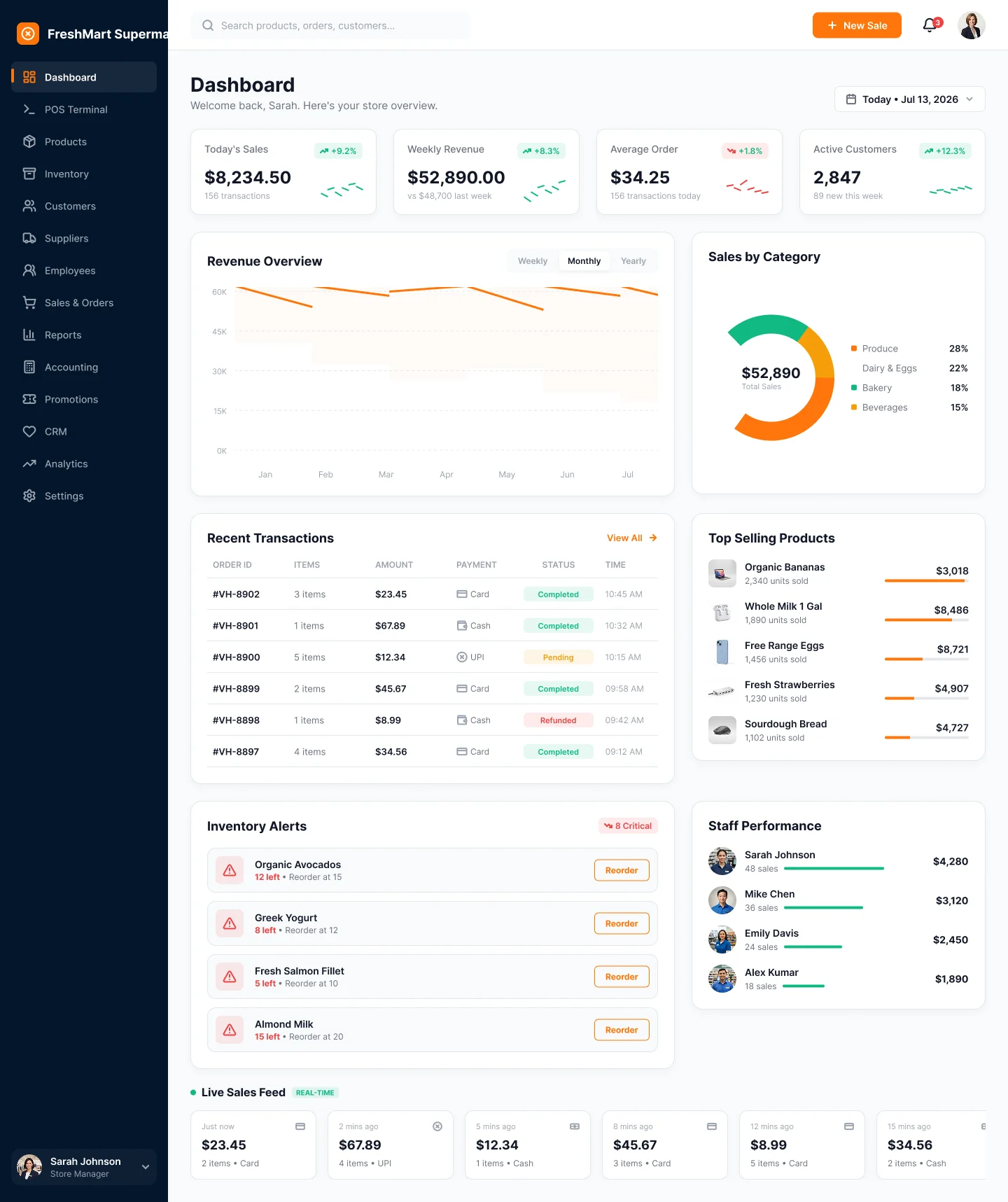
03 · Dashboard
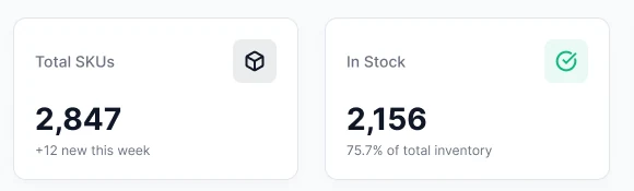
The manager’s home screen starts with the numbers that matter and ends with actions, not just charts.
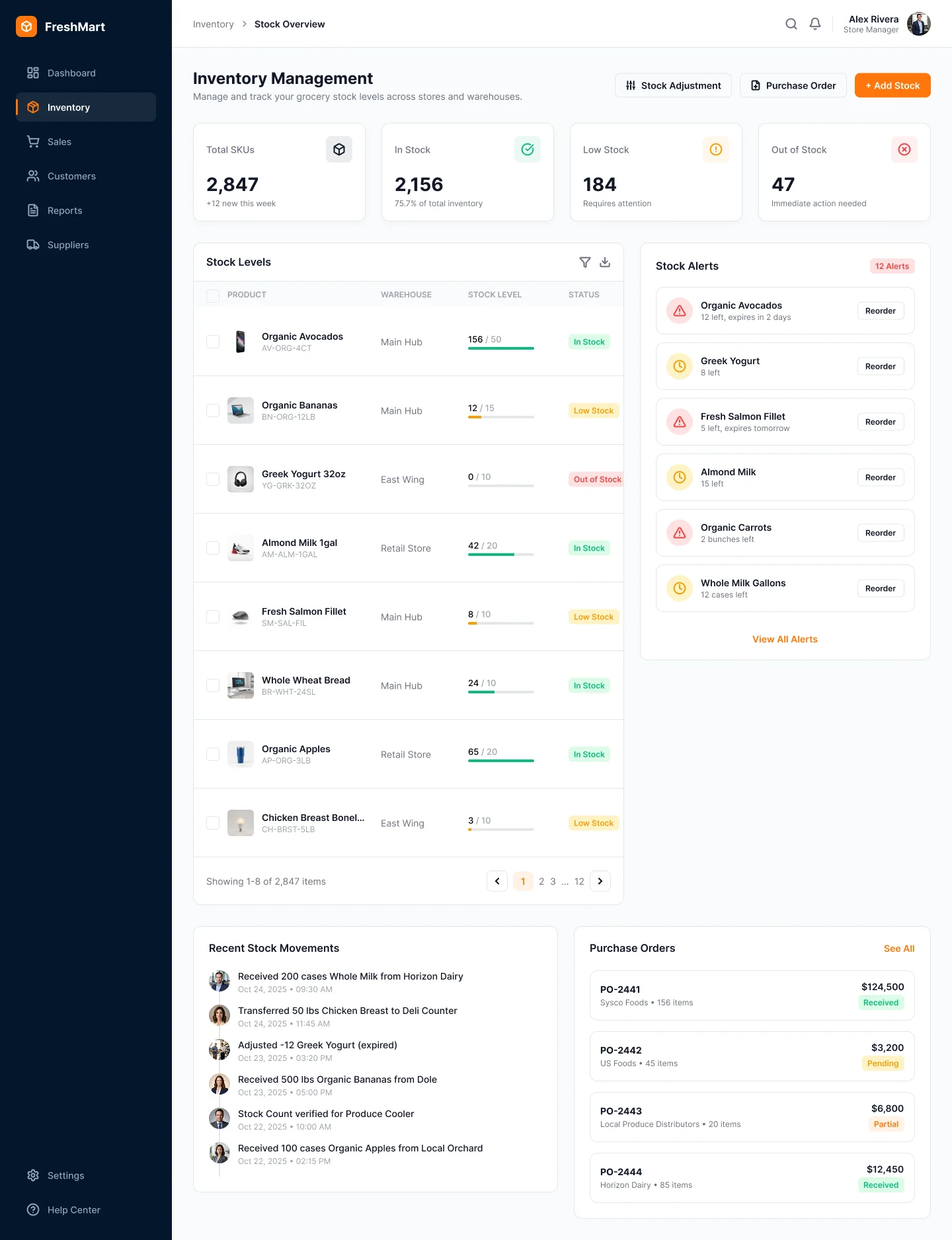
04 · Inventory
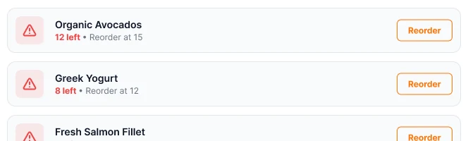
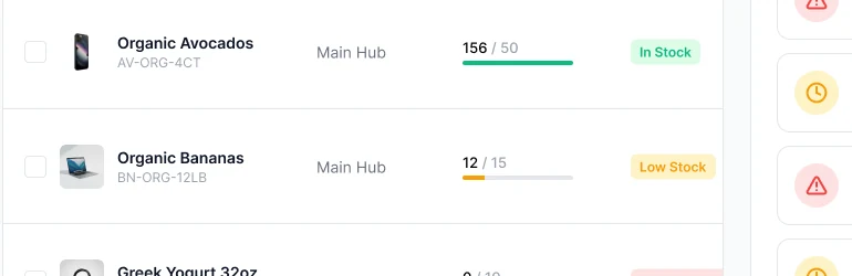
Inventory is organised around risk: what is low, what is out, and what is already on order.
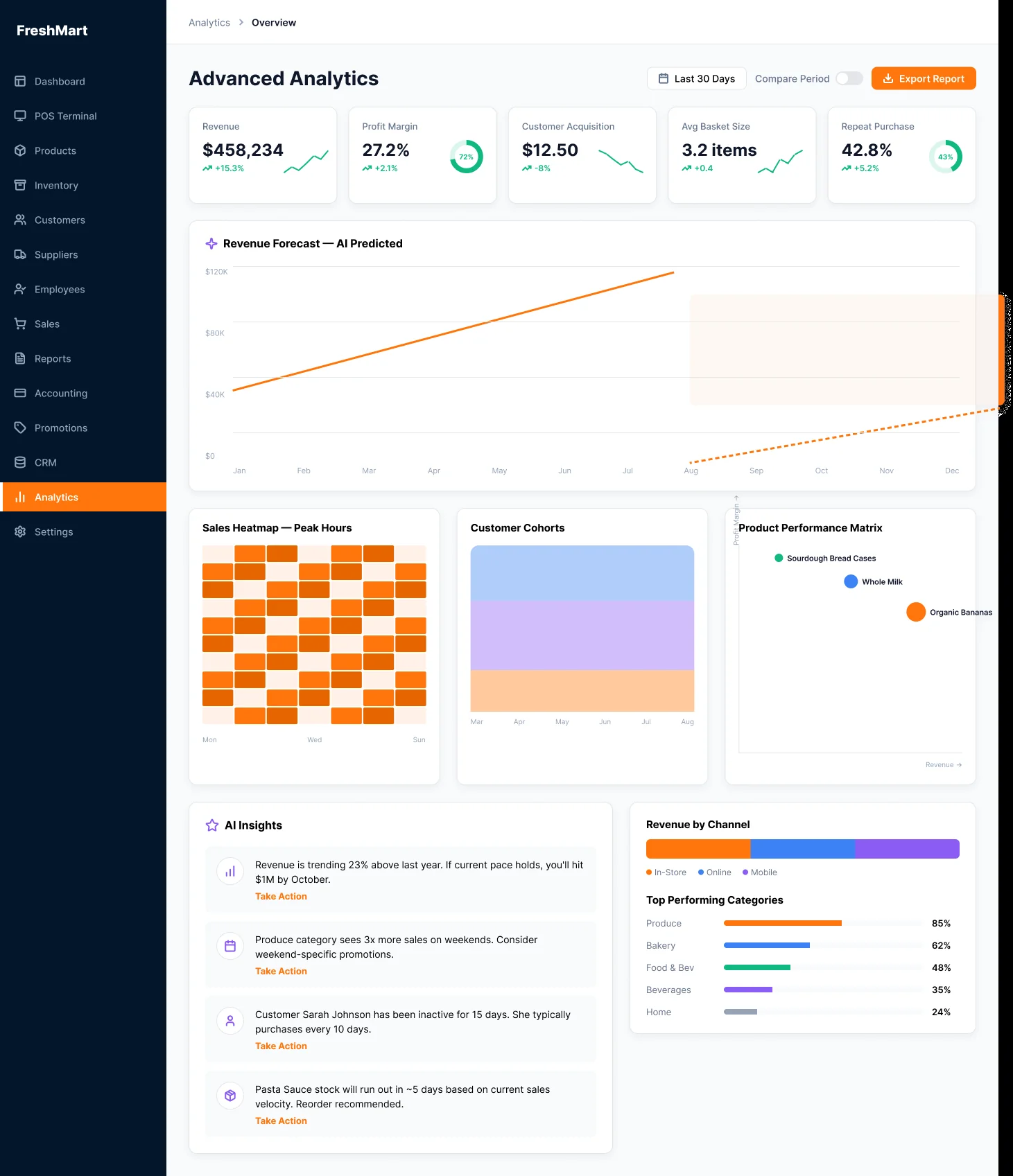
05 · Analytics
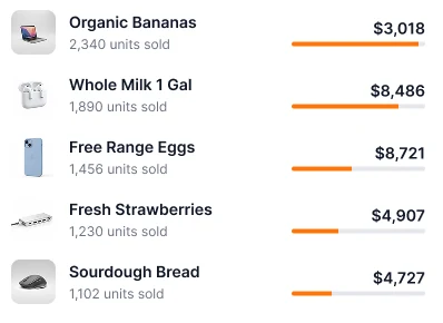
Beyond tables, the analytics view points at what to look at next: peak hours, customer cohorts and the products that perform.
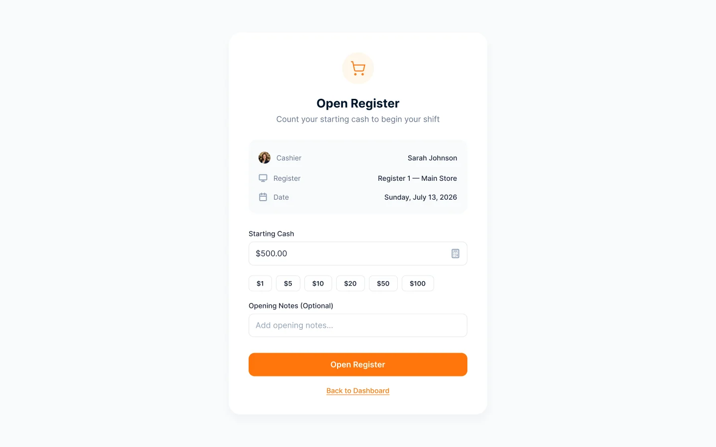
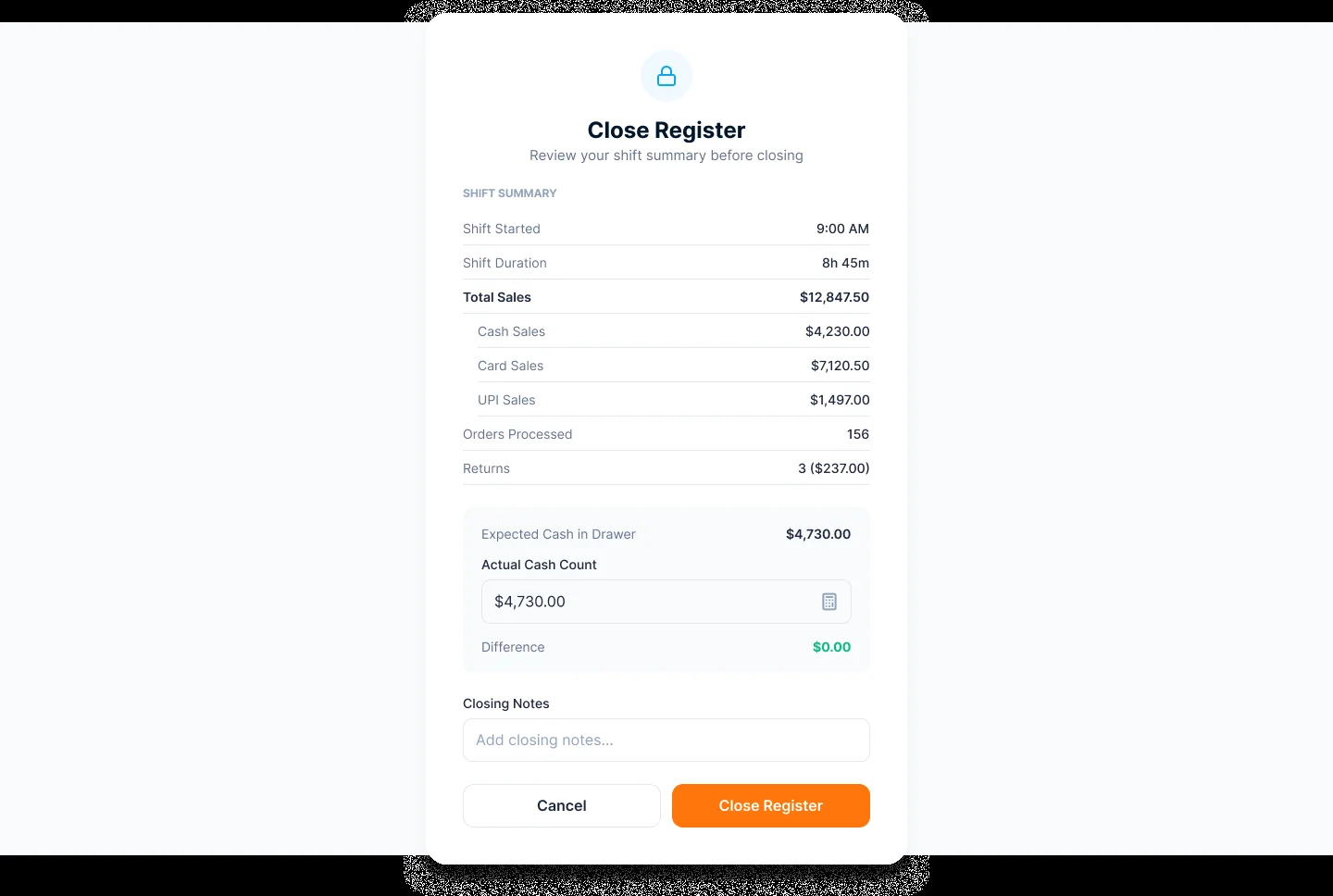
06 · Registers
Opening and closing a register is a short, guided task with clear checks on cash.
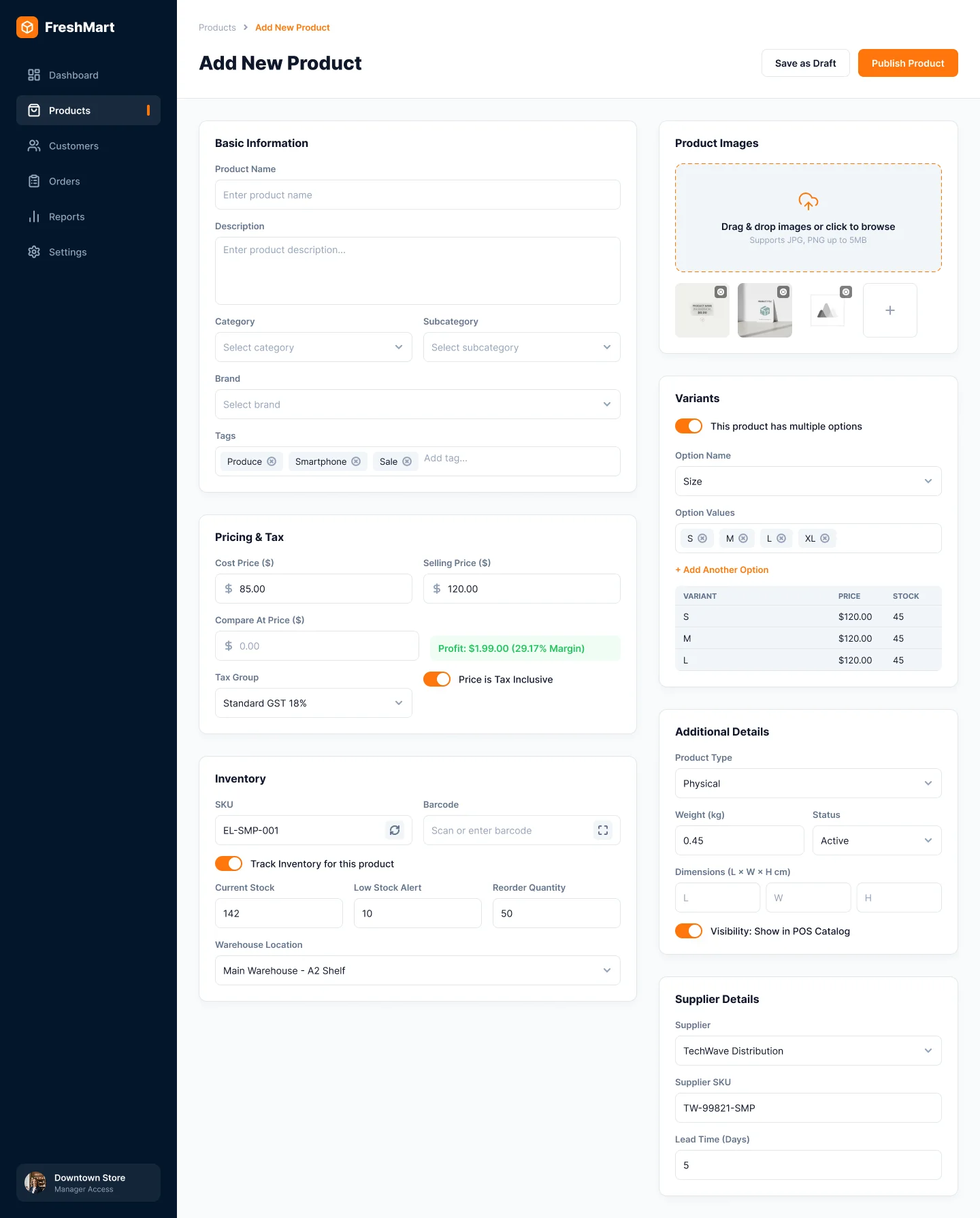
07 · Forms
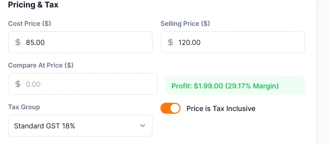
Adding a product touches pricing, stock, variants and suppliers. The form groups these into clear sections with guardrails built in.
08 · Responsive
On tablet the product grid and the order sit side by side. On mobile the dashboard becomes a single column with a bottom navigation bar.
Every state
Sign-in, empty lists, errors, missing permissions and loading are designed too, so nothing falls back to a default.
Design system
Colours and components below are taken from the finished screens, so the system documents what is actually in the design.
#FF760CPrimary actions, active tabs and chips#03162BSidebar and POS header#111827Headings and primary text#6B7280Secondary text and labels#F8FAFCApp background#10B981Completed, in stock, positive trends#F59E0BPending and low stock#EF4444Refunded, errors and critical alerts#E7F8F2Completed badge background#FEF5E6Pending badge background#FDECECRefunded badge background#17283CSelected item in the sidebar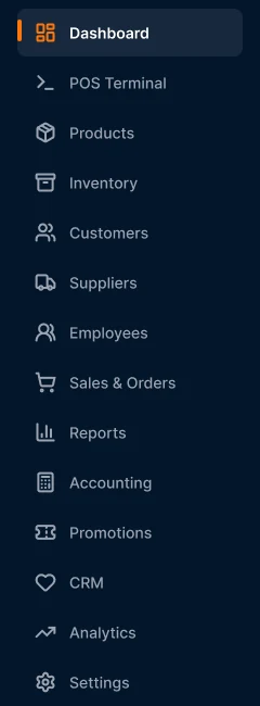




The rest of the system
The remaining modules follow the same shell and components. Select a screen to open it full size.
Reflection
Designing 32 screens on one system meant deciding once and applying everywhere: a single shell, one colour logic and one set of components for tables, forms, modals and states.
It also covers the work that is easy to skip: empty, error, loading and permission states, a guided register flow, and tablet and mobile versions of the key screens.
Next steps
01
Run the terminal with real cashiers and time a full sale, then adjust tap targets and order-panel density from what they find.
02
Swap the placeholder product imagery for real grocery photography so the catalogue reads as a real store.
03
Check colour contrast, focus order and keyboard operation across the system before it is built.
04
Turn the components into a coded library with tokens, so design and development share one source of truth.
Work together
I design systems and build them. Tell me about your team and what you are working on.
Need something similar?
This project is an example of my ui/ux design and frontend development work.
More projects

Company project at Infinite Open Source Solutions LLP. Track time, manage projects, and boost productivity all in one place. Desklog gives teams clear insights to work smarter and move faster.
My role UI/UX design and frontend development
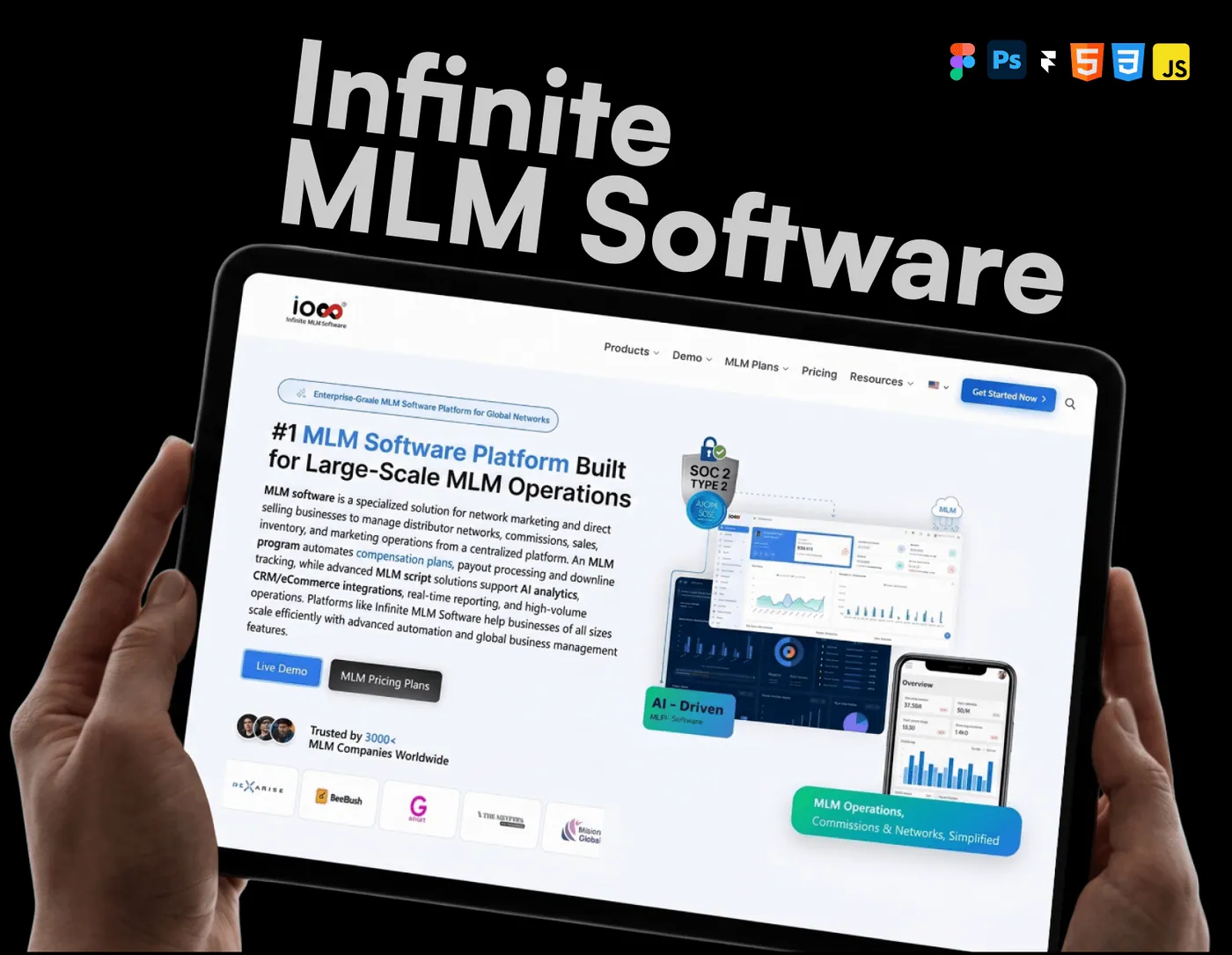
Company project at Infinite Open Source Solutions LLP. Manage your network, automate commissions, and scale your business with ease. IMS brings everything together in one powerful system built for growth.
My role UI/UX design and frontend development


